Hero message and colored text to grab attention
Theme preview

Welcome to the demo! Let us see how the theme looks in action. When writing an article, use text-justify to neatly align a paragraph, and use the big-first class to enlarge the first letter. If you want to nudge the first line, use the indent class. Indentation gives a sense of order and clarity, making an article easier to read. You may also include images and hyperlinks to make things more engaging.
Leave whitespace between paragraphs for clarity.
You may notice some gibberish text in this demo. It’s just a placeholder content added to help you visualize how the layout, spacing and typography will appear once real content is in place. The gibberish text itself doesn’t carry any meaning, it’s simply there to fill the empty areas and make the overall design feel balanced and complete. Each line and section shows something different, though none of it is meant to be understood literally. It’s more of a creative illusion, a way to showcase how color, contrast, and structure come together to create a theme. It honors the “look-and-feel” metaphor for how design can shift and vary in perspective. That’s the beauty of visual design. Every layout tells its own silent story, even when the words themselves means nothing at all.
Open the classic demo page or see how you can start using the theme today!
-
Text can be bold, italic, and both. You can also add
codeandstrike-throughtexts. -
Use HTML to underline texts, add abbreviation, sample, keyboard, or mark texts.
-
Color text primary secondary pending gray slategray red blue green purple yellow orange.
Horizontal rule can be thick or thin. There are two of them following this sentence.
Heading 1
H1 is the anchor of a document. Without it, everything would simply drift into void. Usually there is only one per page, dedicated for the main title. But if you need more, you can make other heading to appear as the main title using the h1 class.
Heading 2
H2 is the pack leader. It organizes sections, leads a group of texts and contents together, and secretly dreams of being supreme someday. Don’t tell it the truth. Let it dream.
Heading 3
It is larger than the rest, yet forever humble in the shadow. A bit redundant sometimes. H3 loves details and subtopics. But if you go too deep, suddenly you’re in H6 territory, and nobody reads that far.
Heading 4
H4 is almost forgotten though technically useful, but no one really cheers for it. You’ll use it only when you have to, like adding extra layers to a report nobody asked for. He is always invited, never remembered.
Heading 5
Remember that tiny notebook you bought to look organized but never actually use? It’s small, it’s cute, it’s there, but honestly, body text is almost the same size, so why bother? H5 knows its fate but accepts it gracefully.
Heading 6
Then comes H6, so small it whispers. Nobody notices it. Even search engines squint and go, “Wait, is that… a heading?” H6 is like writing a title with a pale ink, only the bravest readers will ever see it.
Blockquote
This is a blockquote.
You can style blockquotes.
You can stack them too.
Apply any style you like.
Code block
Markdown render `code block` as is.
    white-spaces, new lines, tabs and all.

Long, single-line `code block` should not wrap. They should remain on a single line instead of breaking into multiple lines. If the line is too long to fit within the visible width of the page, the reader should be able to scroll horizontally to see the rest of it. This line should be long enough to demonstrate this.
// Javascript code with syntax highlighting
var fun = function lang(l) {
  dateformat.i18n = require('./lang/' + l)
  return true;
}
# Ruby code with syntax highlighting
GitHubPages::Dependencies.gems.each do |gem, version|
  s.add_dependency(gem, "= #{version}")
end
<!-- Html code with syntax highlighting -->
<html>
  <head>
    <meta charset="utf-8" />
    <title>Hello World</title>
  </head>
  <body>
    <p>Hello, World!</p>
  </body>
</html>
Hyperlink
Build link to another page. But if you link to a missing page, you’ll get an error.
Button link
PrimarySecondaryDefaultGraySlategreyRedGreenOrange
Footnote link
Footnote links are those little link that brings you to the note1 at the bottom of a page.
Click the link to see an example2.
A footnote can be written in multiple lines3.
Normally we use number as reference, but you can use word4 as well.
Images
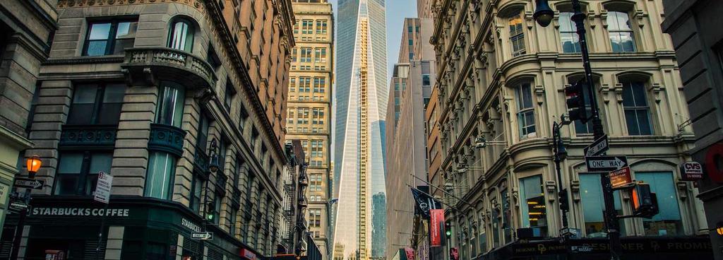
Some images on this demo came from picsum.photos.
Use the width-full or width-fit class for large images. Use float-left, float-right or centered to align them.

Box wrapper
Use box to create a wrapper.
Custom box.bg-blue
Apply any style you like
Details and summary
Collapsible content. (click for more)
The details and summary block, is a collapsible accordion of destiny where content hides until poked by the click of curiosity. It is the digital equivalent of whispering, “psst, wanna see something cool?” and then rolling out a red carpet of hidden paragraphs, secret snippets, or the occasional diagram that nobody asked for. The summary is the bouncer at the door, deciding whether the reader gets a glimpse inside or stays staring at the title forever, while details hoards all the juicy stuff like a dragon sitting on its markdown gold.
Style with box. (click for more)
box. (click for more)This block expands like curtains on opening night, then folds back up as if nothing ever happened, gaslighting your memory of what you just saw. Authors toss long-winded explanations, secret Easter eggs, or poorly formatted cat ASCII art inside it, knowing only the brave will click. In its most chaotic form, the details block nests within itself, collapsing collapsibles within collapsibles until the reader spirals into an abyss of disclosure toggles, wondering whether the summary is summary enough to summarize the summaries.
Ordered list
- First level item.
- Second level item.
- Third level item.
- Other item.
- The last item.
- Other item.
- The last item.
- Second level item.
- Other item.
- The last item.
Unordered list
- First level item.
- Second level item.
- Third level item.
- Other item.
- The last item.
- Other item.
- The last item.
- Second level item.
- Other item.
- The last item.
Task list
- Completed task.
- Pending task.
- Second level.
- Second level.
- Third level.
- Third level.
- Last task.
- Last task.
- Last task.
Definition list
- Term
- Definition or description.
- CSS
- A stylesheet language for styling web pages.
- JavaScript
- A programming language that adds interactivity to websites.
Table styles
Normal table
| Name | Membership | Value |
|---|---|---|
| Gary | $1,124 | |
| Howard | Premium | $5,678 |
| Sally | Gold | $9,012 |
Simple table
| Name | Value |
|---|---|
| Ahmad | $1,124 |
| Greg | $5,678 |
| Susan | $9,012 |
Borderless table
| Items | Status |
|---|---|
| Good leaf | Ok |
| Plenty ticks | Ready |
| Zapper | Pending |
| Coute sauce | Ok |
Full-width table
| Left | Center | Right |
|---|---|---|
| Good fish | Ok | nice |
| Plenty box | Out of stock | yeah |
| Biscoite | Ok | hmm |
| Zoute drop | Ok | tumm |
HTML table
| Label | Status | Value |
|---|---|---|
|
Good | $78,910.12 |
|
Pending | - ($1,234.56) |
Footnotes
-
A typical footnote contains: The author’s name, the article title and publication details. ↩
-
For example: John Smith, Modern Web Design (New York: TechPress, 2023), page 45. ↩
-
You can also write a footnote in multiple lines. Every new line in a footnote should be prefixed with 2 space or 4 space indentation. ↩
-
Named footnotes will still be rendered in numbers, but the text reference allow easier identification. ↩